Painting with neutrals
This snippet has been taken from “Painting Your House Inside And Out Thunder Bay San Diego, California”. Painting with neutrals means without color such as beige, ivory, taupe, black, gray and shades of white appear to be without color. “Washington DC painters“, provides relevant info on these painting tips.
Painting with neutrals
To understand the role of neutral colors, consider a traditional winter landscape in a temperate climate: snow, bare trees, fragments of dried grass, gray boulders, and leafless shrubs sticking out from the icy terrain on an overcast day.
Without an impression of strong color, other visual qualities become apparent; details of form and texture seem more pronounced. This is the power of a neutral palette, and the reason it remains an ever-popular strategy for painting rooms.
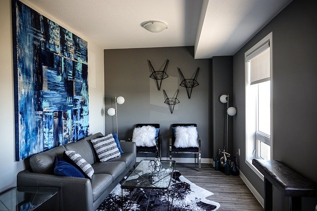
Black and white and all tones of gray in between, plus the lighter side of the brown family, constitute those hues that are considered neutral. Yet this label does not mean that using neutral paints in rooms will result in drab or unexciting spaces. Every paint colour makes a statement, and these shades are no exception. Anyone who has seen one knows the vitality of a successful black-and-white room, or the enveloping comfort of an all-beige room full of interesting shapes and textures.
One of the most exciting aspects of a neutral palette is its broad flexibility; myriad combinations of whites, grays, beige’s, and blacks work together harmoniously. Thus, pairs, triads, or quartets of neutral shades can be ideal for painting walls in broken color effect. A creamy ivory wall with a dragged or combed overcoat in a subtly darker shade of beige or gray creates a hint of pattern and texture in a room with many soft and smooth fabrics and surfaces. Walls with a pale undercoat can also be taped off in a large grid, the squares softly delineated by hand-rubbing beige or tan paint next to the taped areas with a soft rage. When the tape is removed, the painted effect creates an illusion of stone blocks- a lovely backdrop for classical, light-colored furnishings.
When a smooth coat of neutral color paint is used for walls and trim, a successful monochromatic scheme can be built by applying similar values of the same color for upholstery, floors, and most other furnishings. Then, punch up the drama of the scheme with fully saturated details. Use deep brown details-pillows, picture frames, candle-sticks-with beige’s and tans, accessorize all-gray schemes with black-lacquered side tables and black-painted baskets. Craft an all-over white scheme, and then add one other colour, using a neutral such as straw or taupe, or a single bright hue from the color wheel, for accessories such as lamps. Throws and pillows.
Applying white paints
Every manufacture’s fan deck of colors contains a large section of whites-sometimes more than one hundred different shades and tints of this supposed non-color. Bright whites make a crisp contrast to almost any other color; often used as a standard treatment for ceilings, they make an adjacent color look more lively and true.
Creamy whites, with a touch of yellow, orange, or brown, have a softer appearance. They mimic warm afternoon light, creating a serene setting for reading and relaxing-a great palette for a library bedroom, or office.
Using creamy whites in discernibly different sheen’s on the walls of a room is one way to achieve an interesting, yet subtle, patterned effect for example, stripe a room with an ivory hue, using eggshell and satin sheen’s of the striped damask. For another elegant hint of pattern, apply subtle stenciled borders in classical motifs along the perimeters of a room using this same serene juxtaposition of gloss levels.
Picking out trim, molding, doors and windows in glossy, creamy white creates a somewhat aged appearance in rooms, especially when these details are paired with walls finished in vintage colors. Off-whites, pearl-whites, and putty tans have this historical connotation for may decorators and designers.
Continue reading on Skim Coating